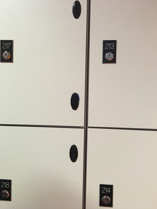
my photography :edges
I am very exited to do a project on edges since there is many possibilities such as photo edges, mirror edges and physical edges. In reality nothing has an edge but when you photograph an object it becomes 2D. Anything can have an edge once it has been photographed .even though the possibilities of 'edges' is confusing it is also endless and exiting and i think i will enjoy this project a lot .
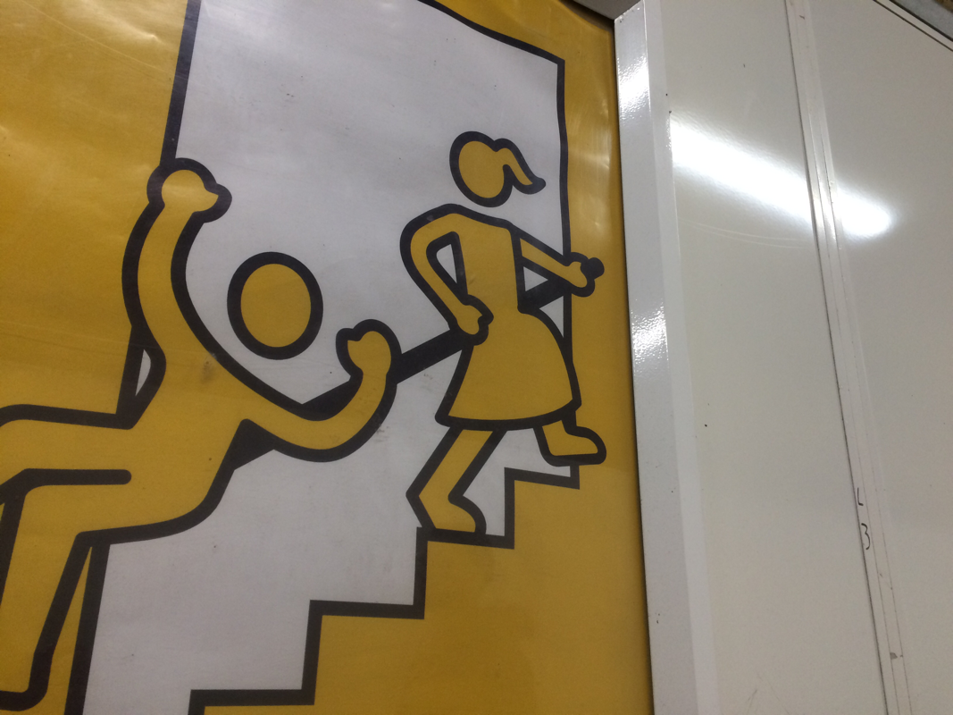
these pictures i took outside inside and in my own time to express the theme edges :)
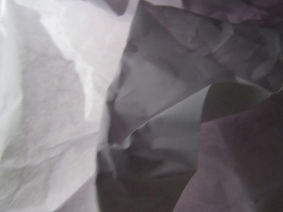
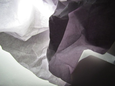
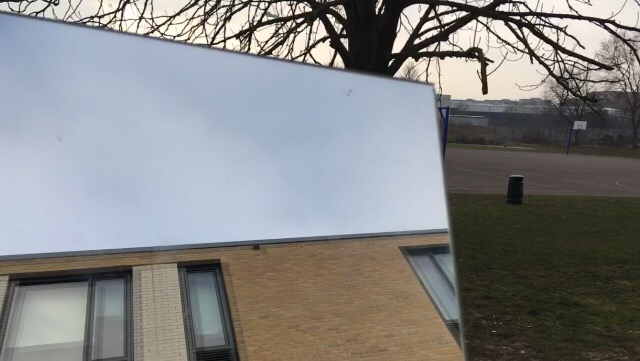
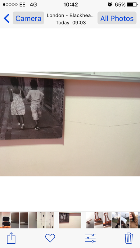
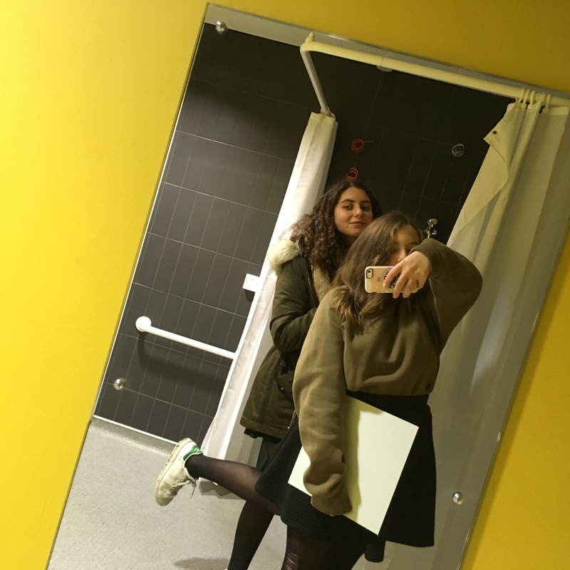
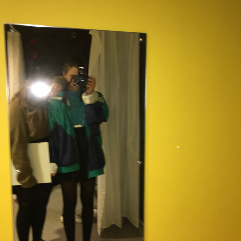
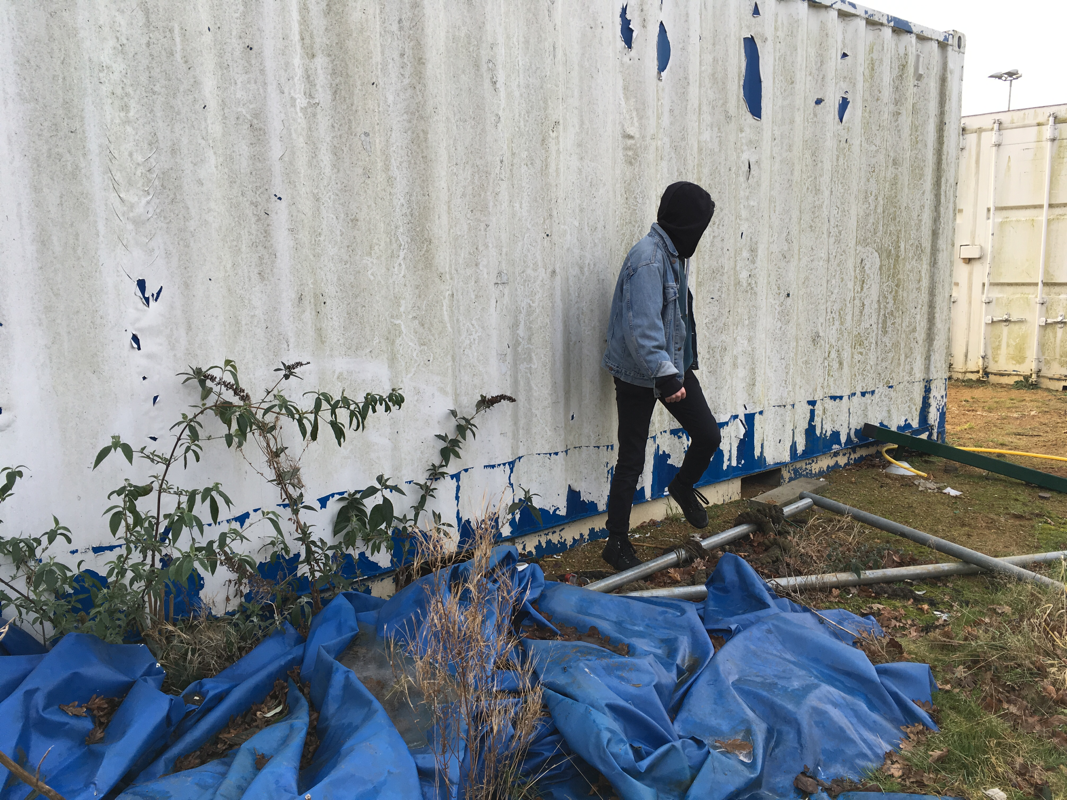
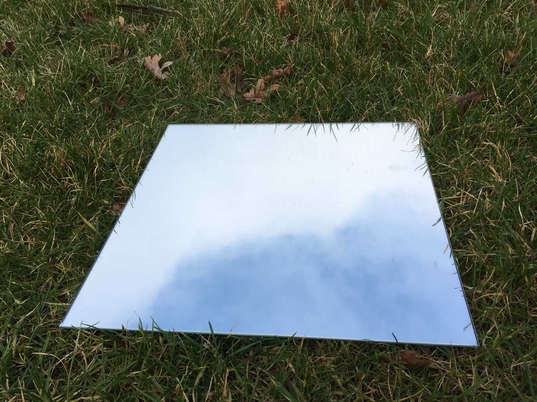
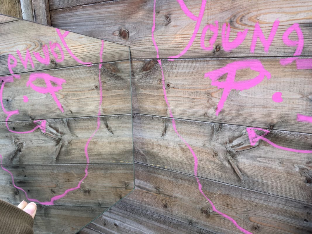
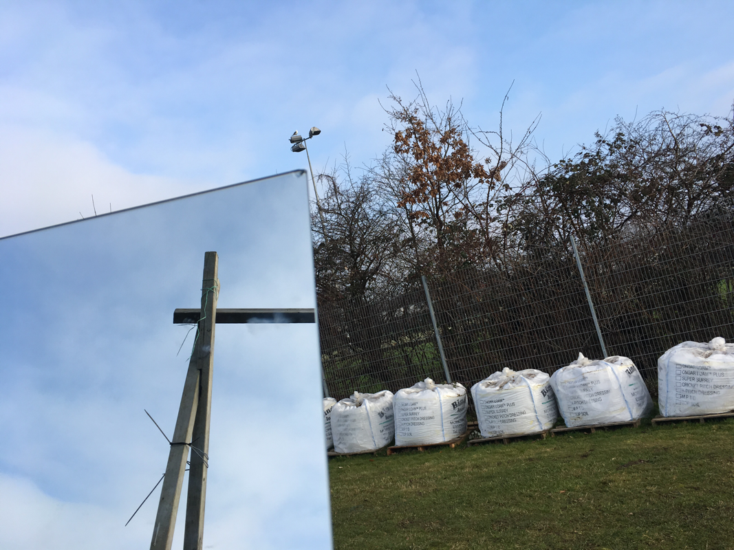
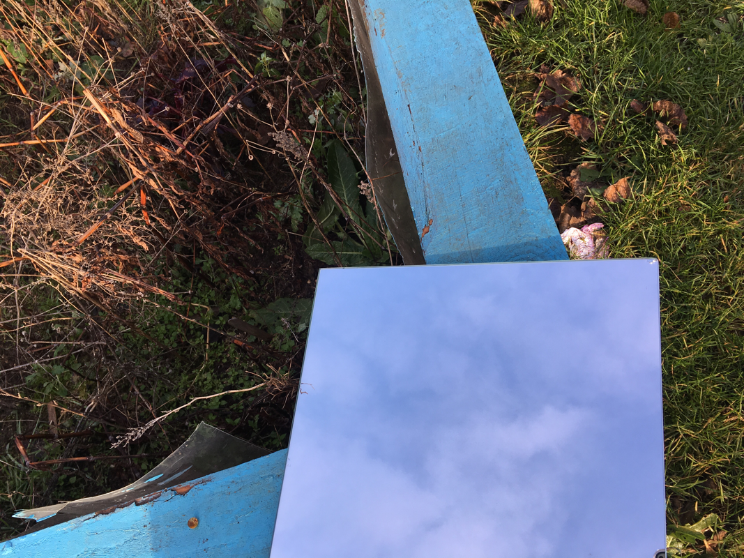
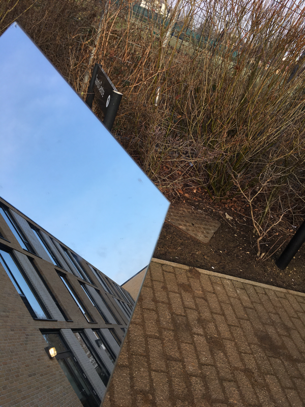
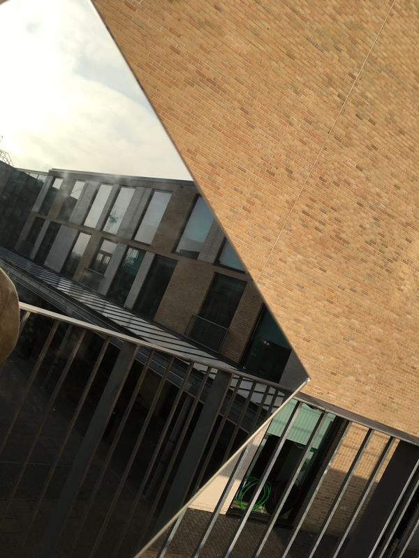
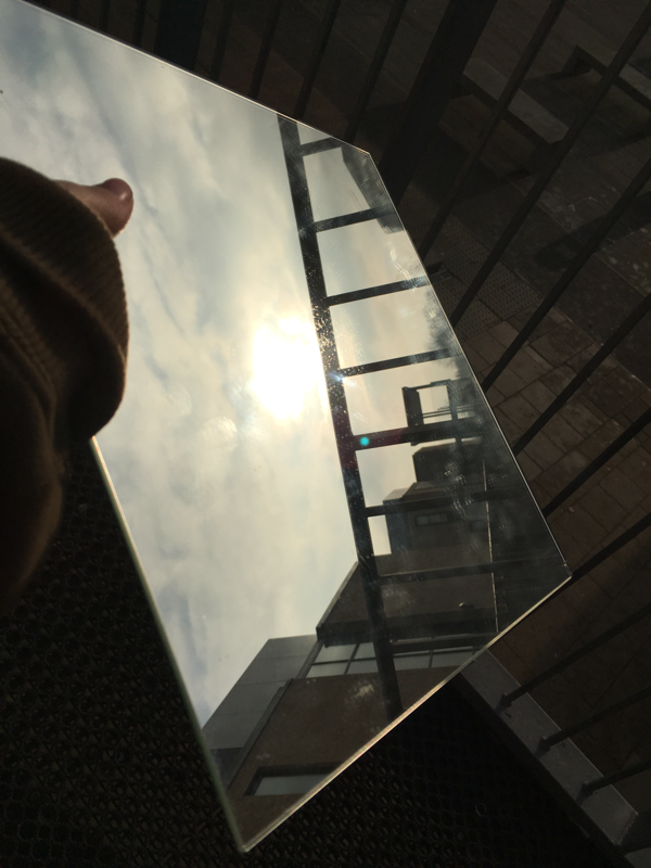
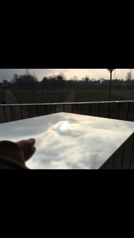
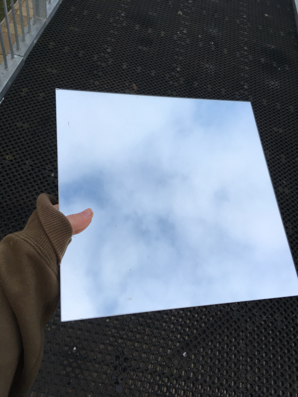
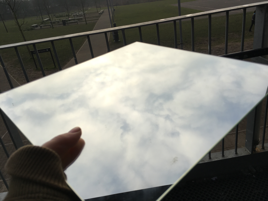
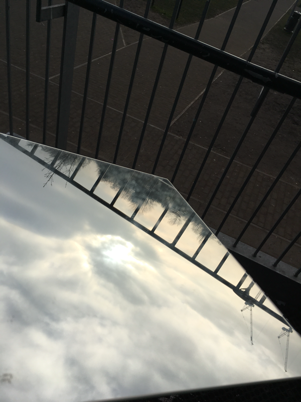
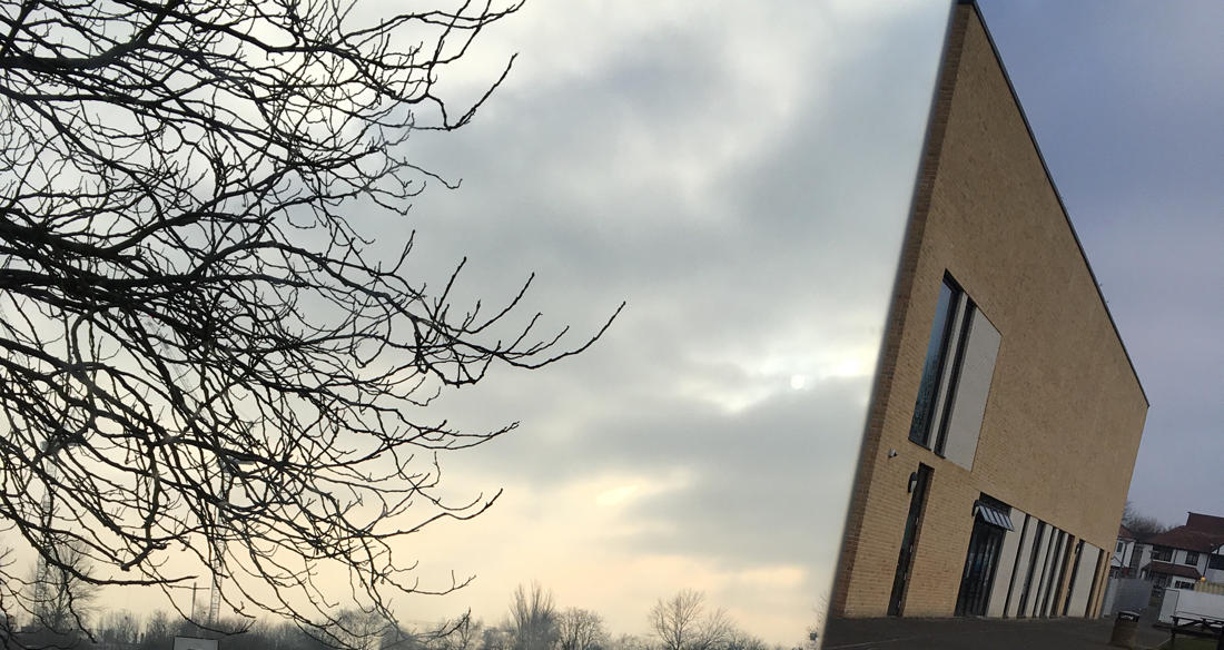
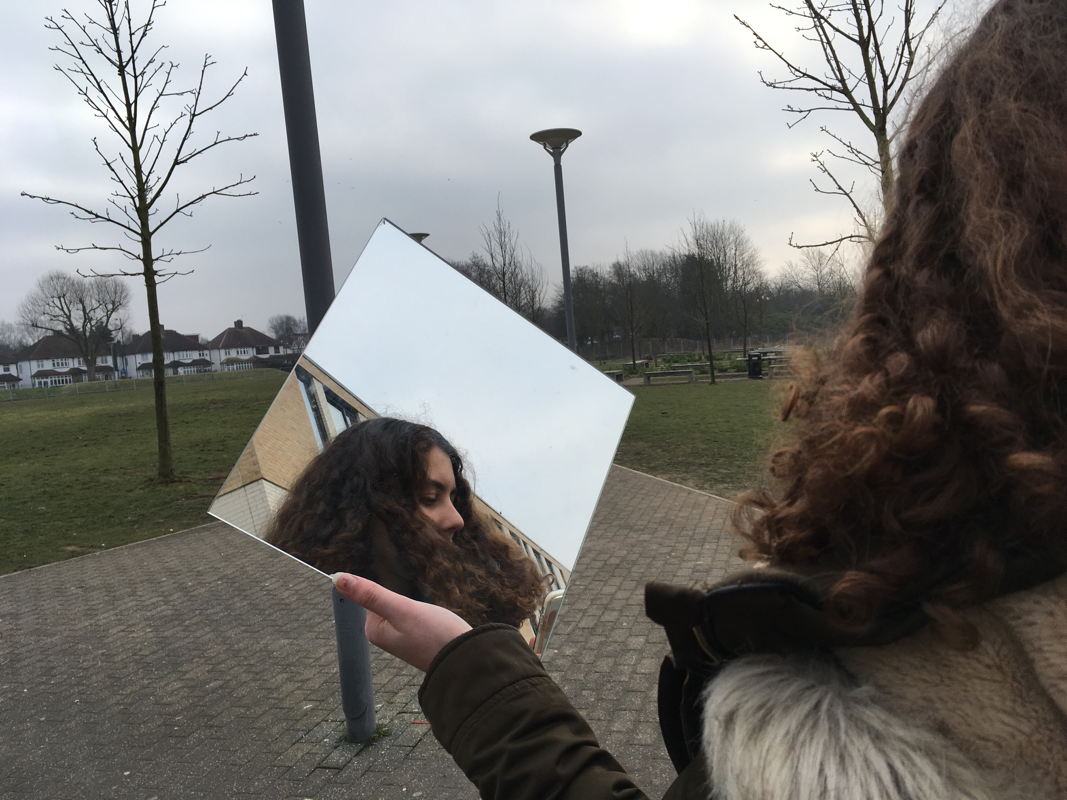
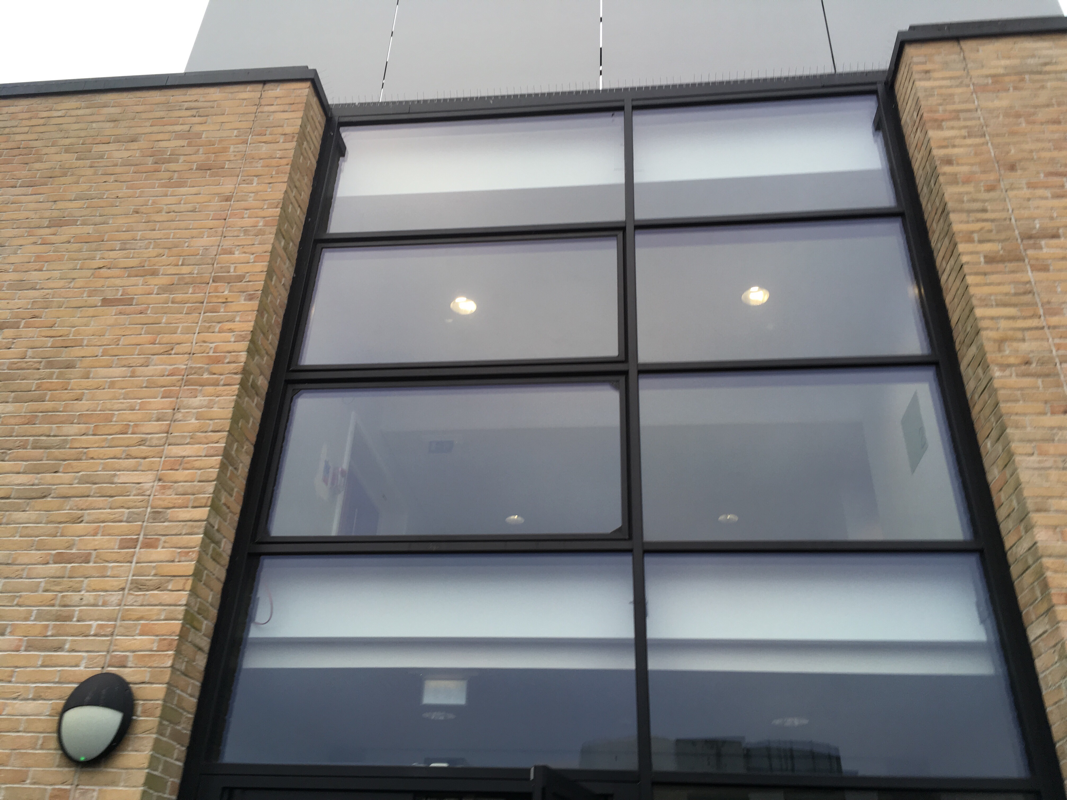
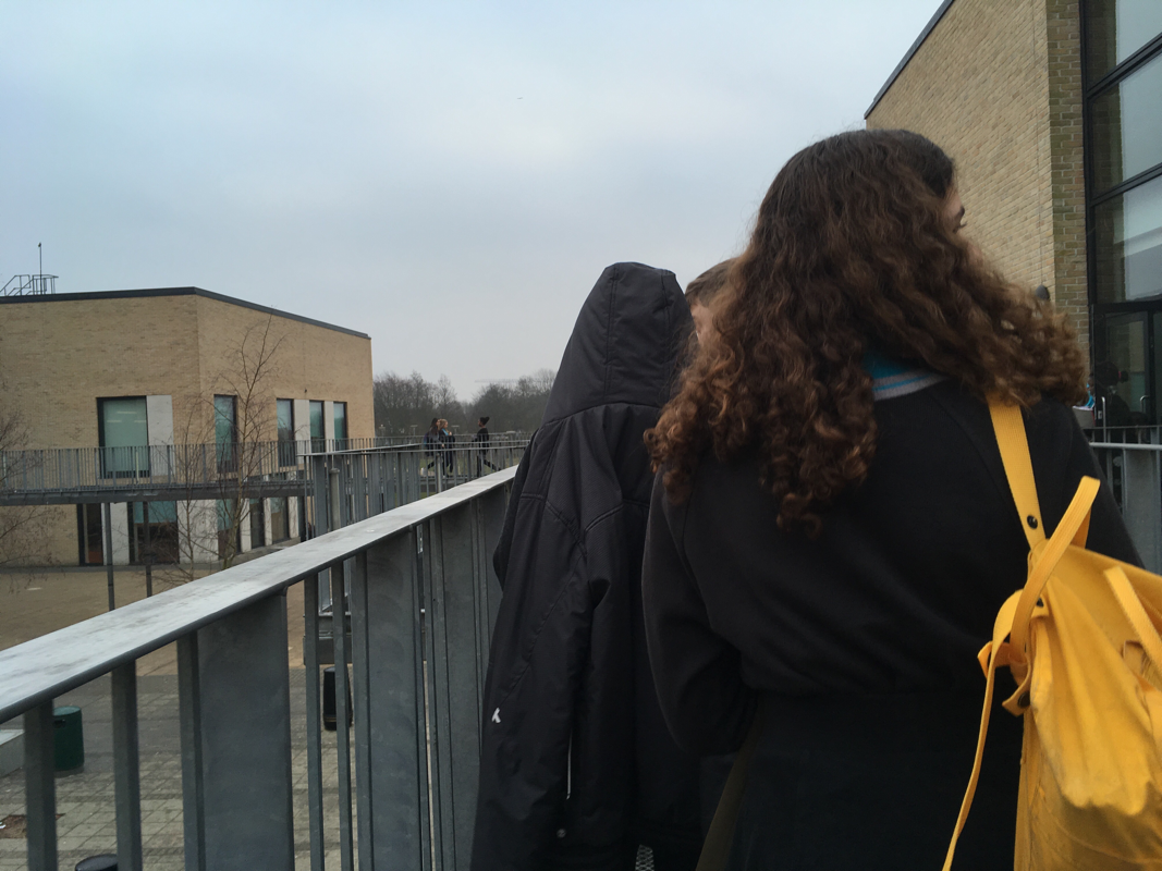
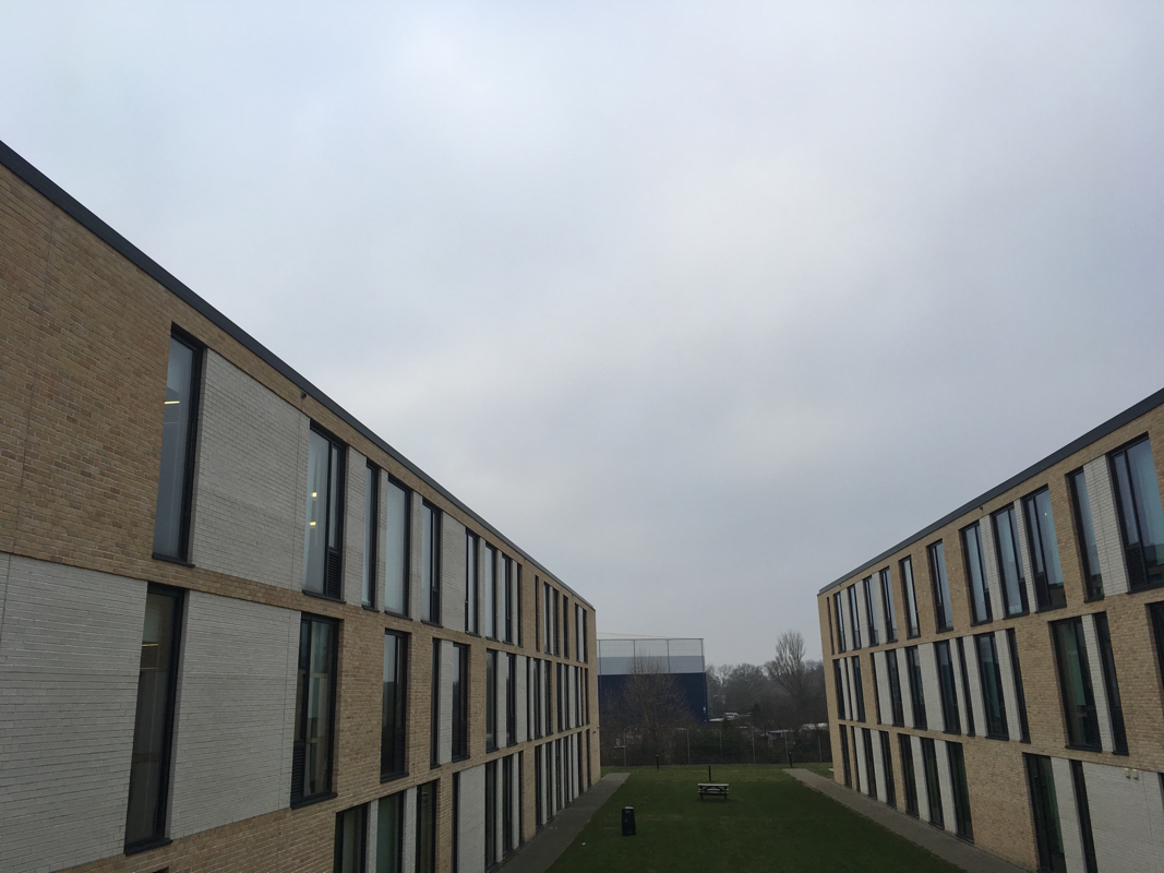
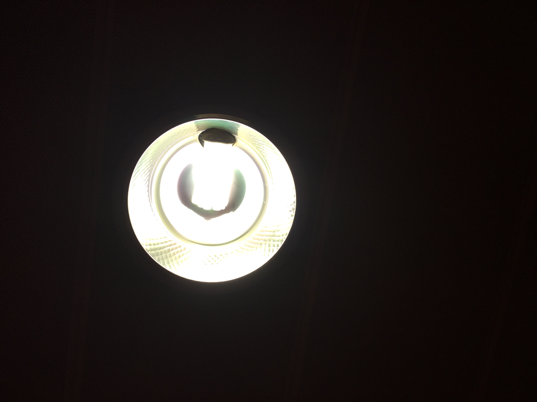
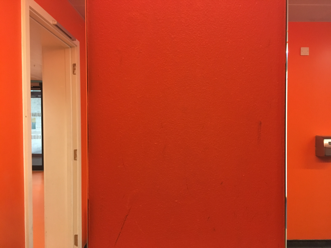
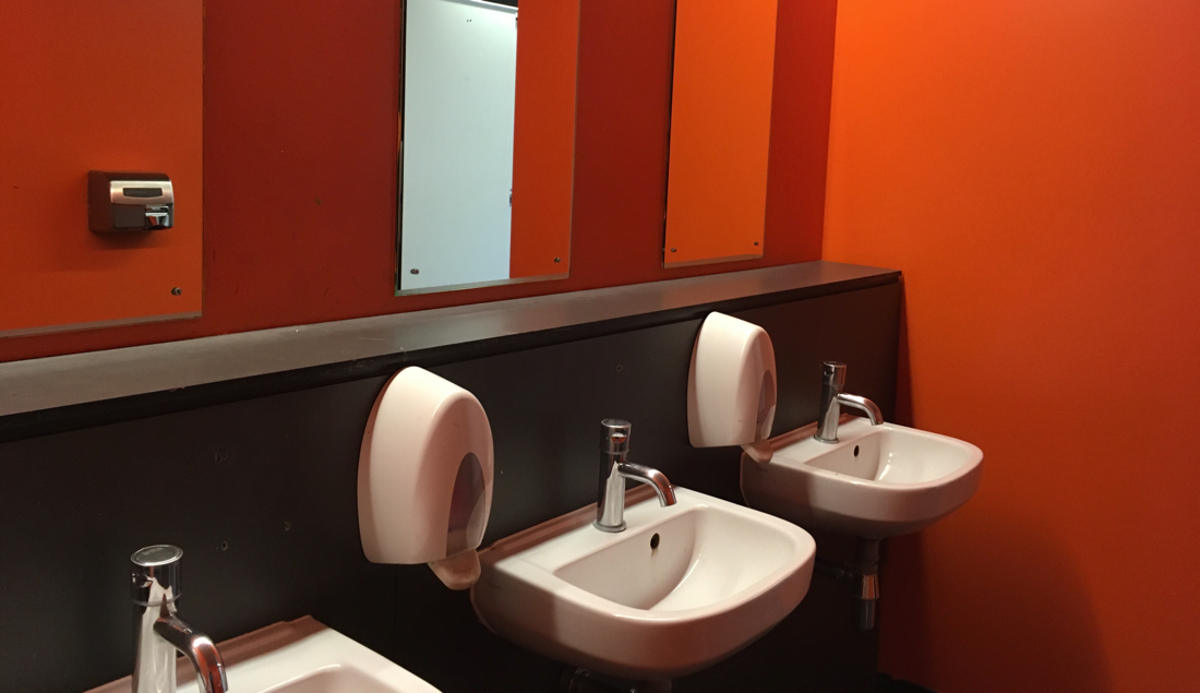
Edges: mirrors
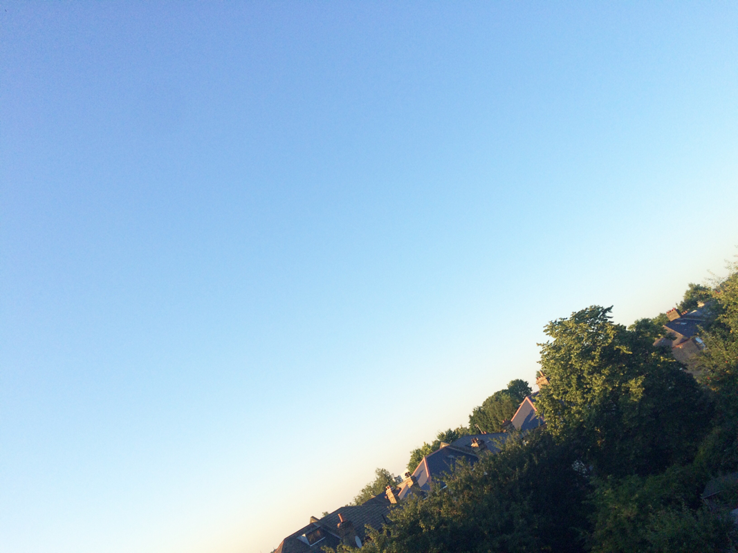
In class sir gave us mirrors and told us to go round the school and make 'edges' pictures with them. This page will display my variety of pictures we took with the mirrors displaying the theme 'edges' in a new perspective .
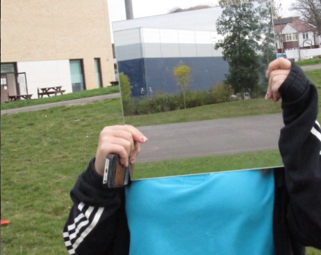
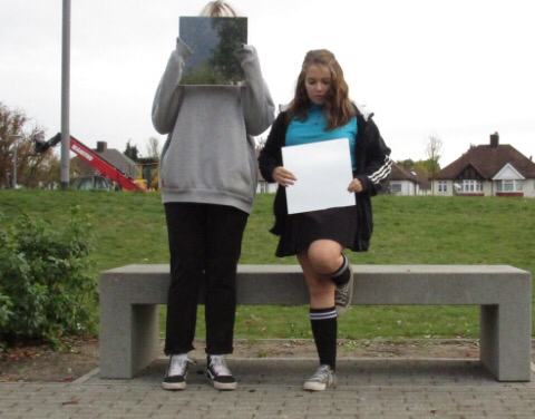
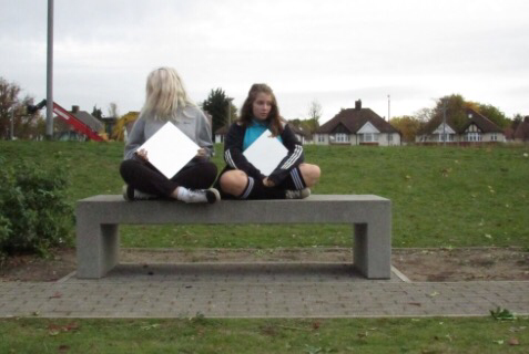
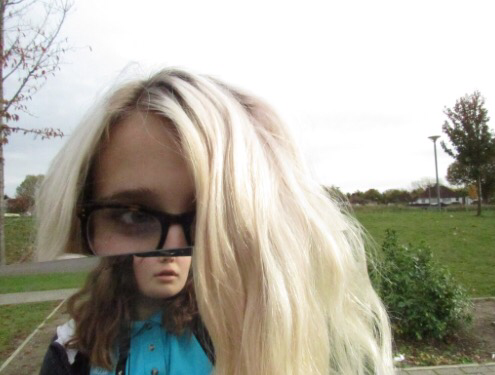
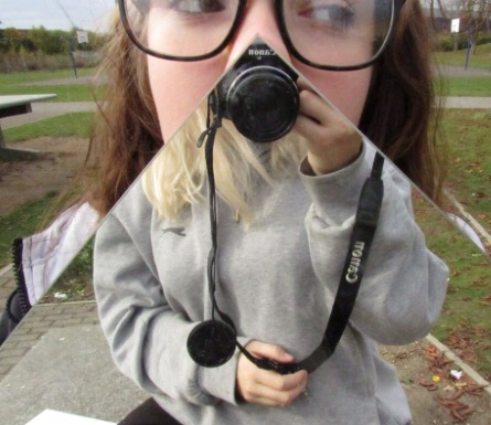
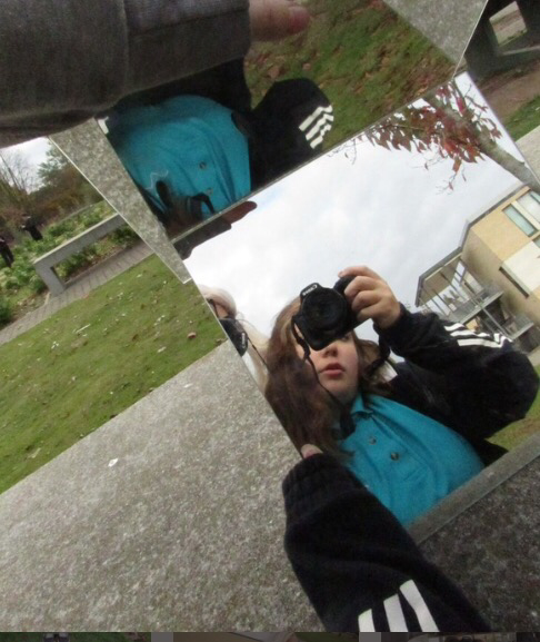
www:some of my photos are verry effective and create an illusion with the mirrors .I also managed to capture many
edges in interesting ways.
EBI:some of the images are not effective because the mirror is only reflecting the sky meaning its not as origional as the
rest
edges in interesting ways.
EBI:some of the images are not effective because the mirror is only reflecting the sky meaning its not as origional as the
rest
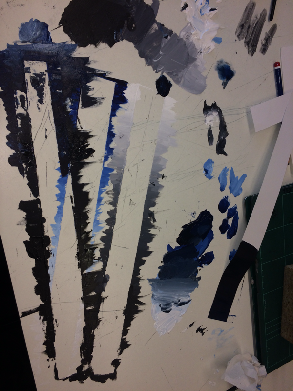
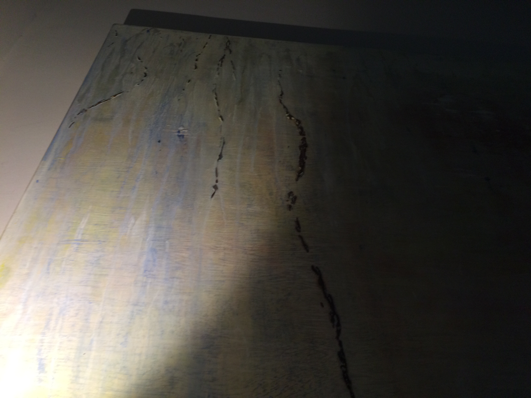
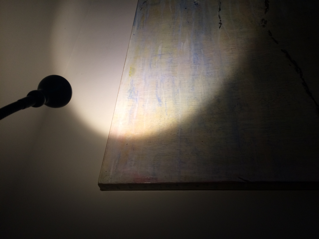
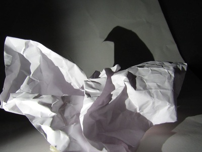
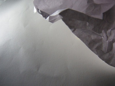
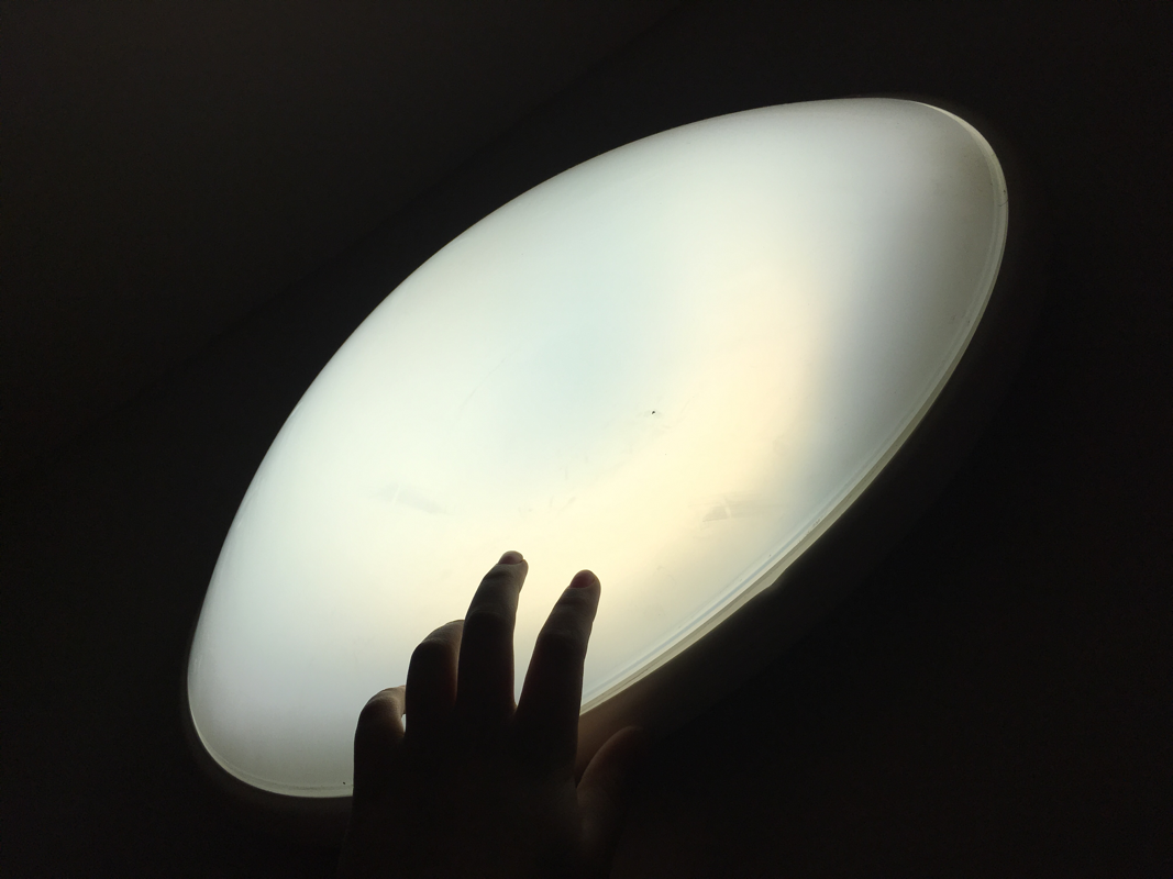
edges:photoshoot
sir told us to fold a big peice of paper to make a back drop .secondly he told us to make interesting shapes with folded paper and then shine our light on the paper to create an interesting shadow . here is my photoshoot .......
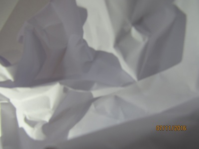
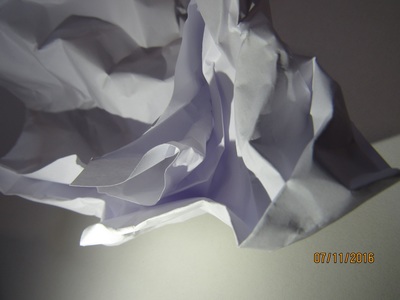
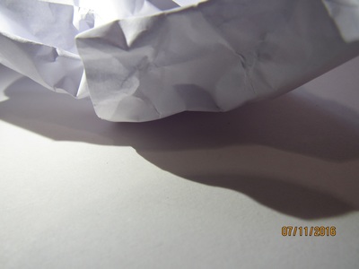
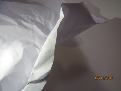
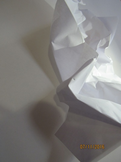

WWW:these photos show my ability to fold paper in interesting ways
EBI:these photos don't show much contrast and some weren't focused .
EBI:these photos don't show much contrast and some weren't focused .
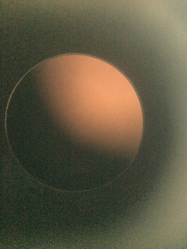
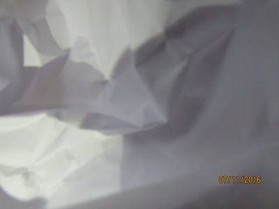
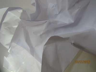
photoshoot no 2
This is my second photoshoot . I have tryed to refine the last photo shoot by focusing the camra more to get a more effective contrast. I also did this photoshoot in the dark room meaning there is a hint of pink in each of thease photos.......


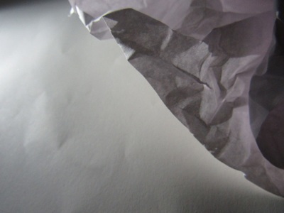

WWW:these photos have effective contrast and interesting shadows .
EBI:we could have tried to put the light in different positions to make the photos more effective .
EBI:we could have tried to put the light in different positions to make the photos more effective .
light and dark
for the sheet on the left we were told to copy the images and not use a rubber so if we made a mistake then we couldnt correct it meaing that we had to really consentrate . for the image on the right we had to use adjectives to describe the images.
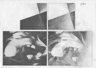
WWW:on the top picture i tried my best to show the shadows and the highlights on the bottom picture i think it looks quite similar to the real one
EBI:in both images i should have have added more shadow to make it look more realistic and have more death . |
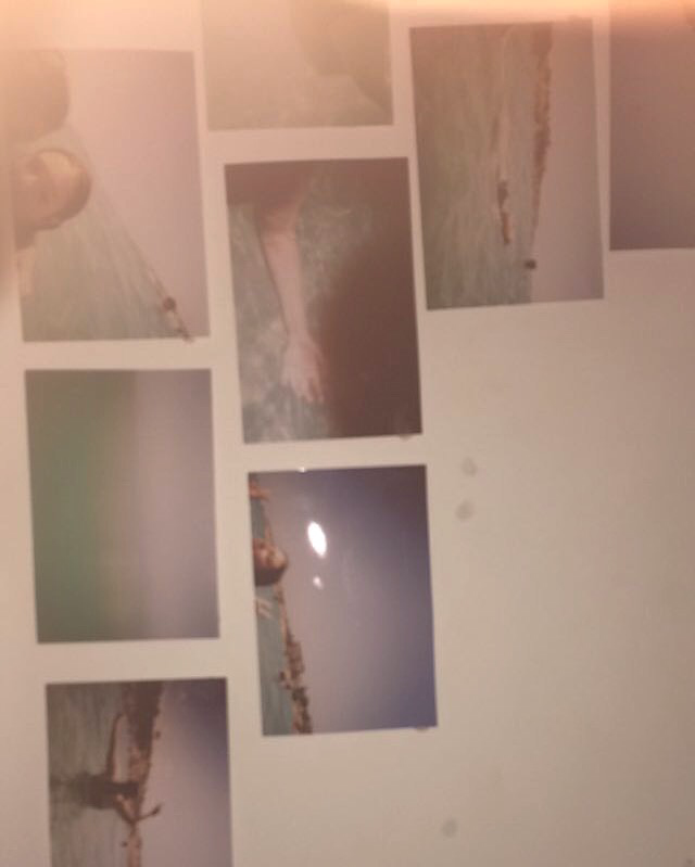
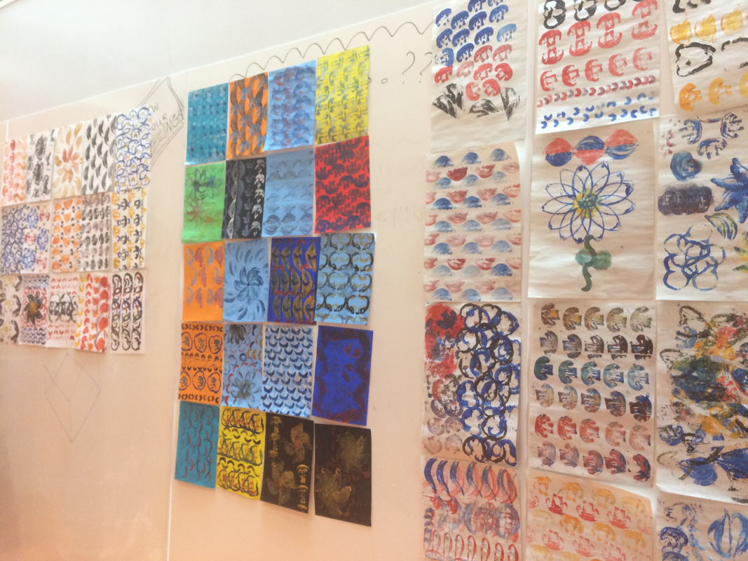
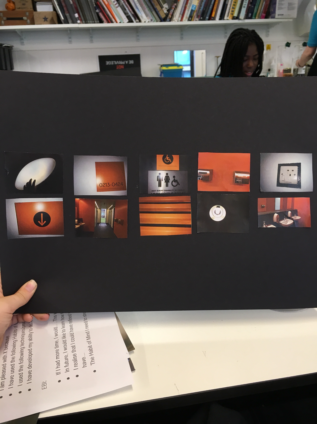
edges photos |
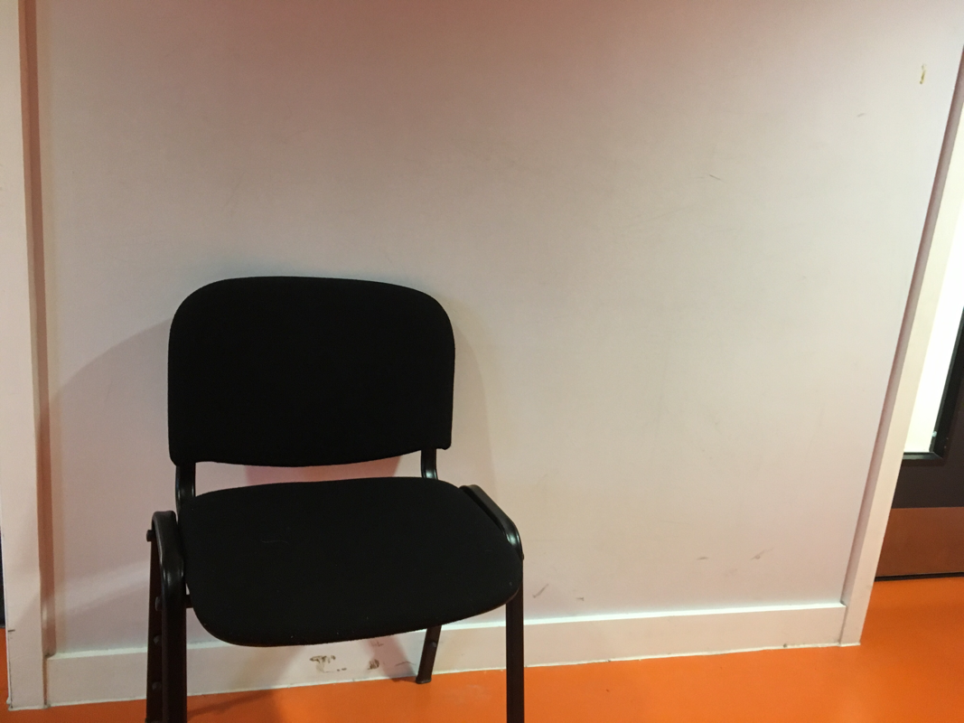
this is a group of photos that i might possibly use for my final gallery .
jelle martens
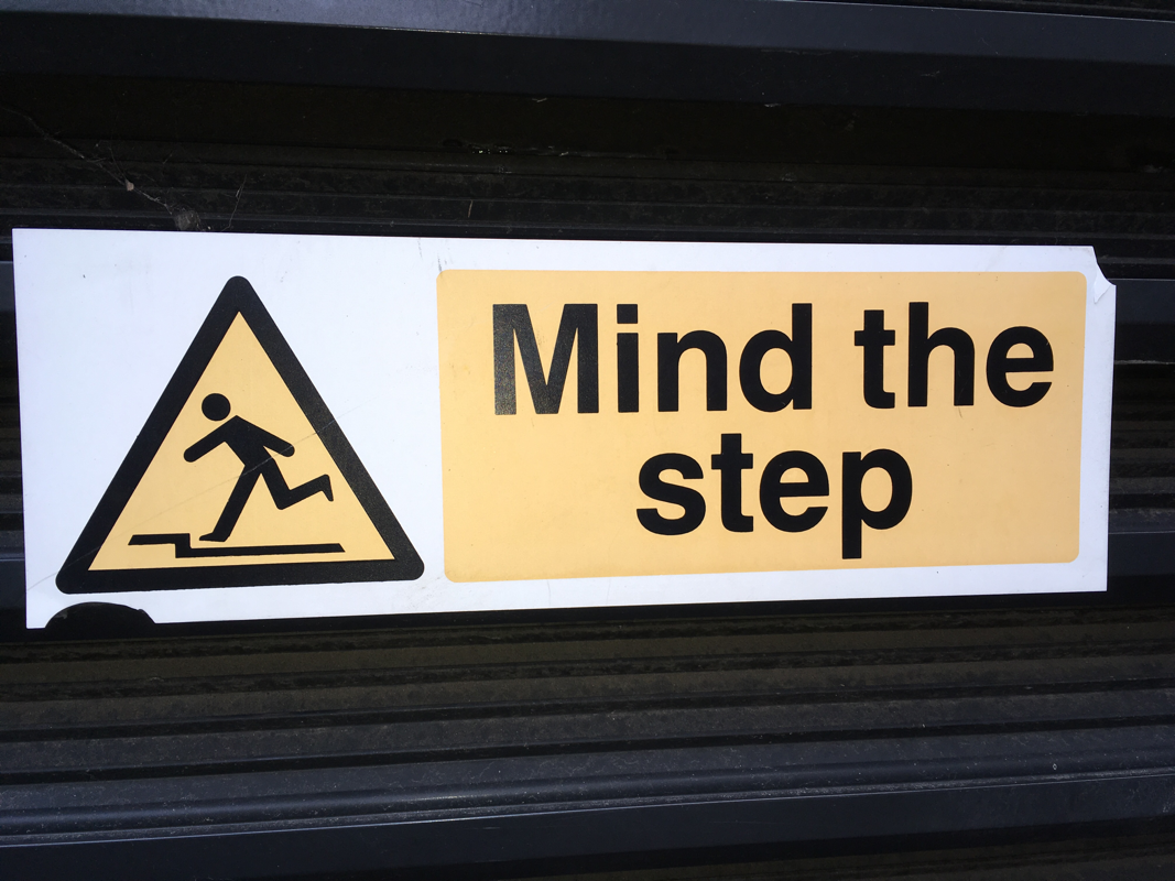
assesment
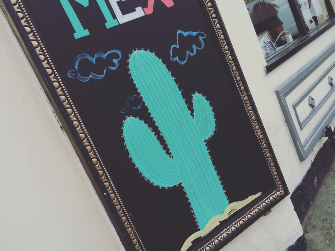
in this task we had an interesting selection of photographs and we were asked to re photograph them in a creative way still incorporating the theme 'EDGES'.
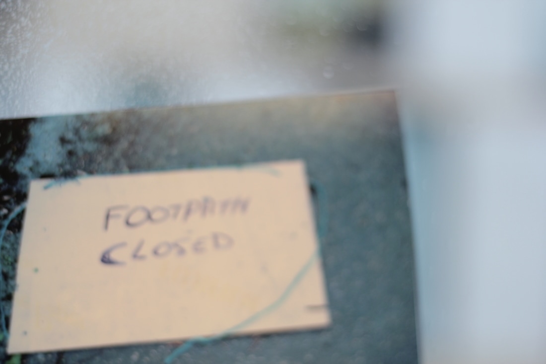
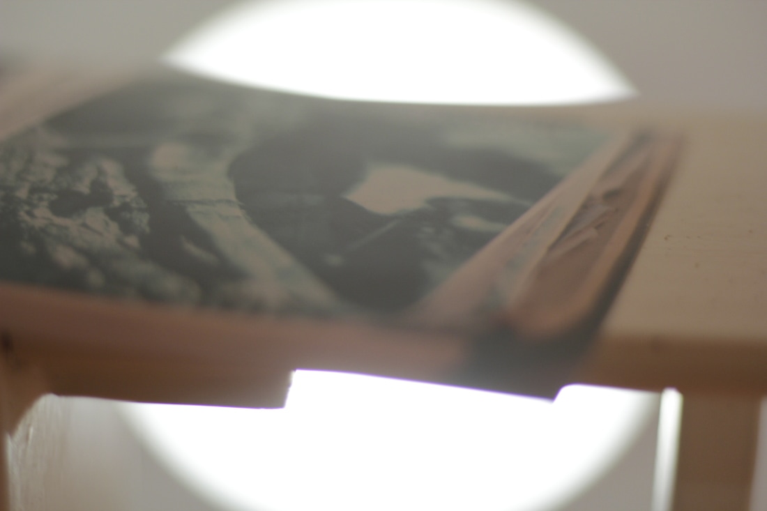
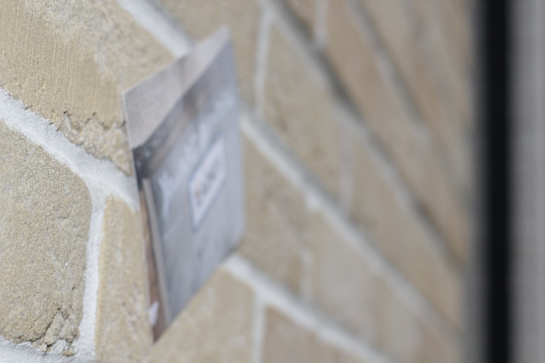

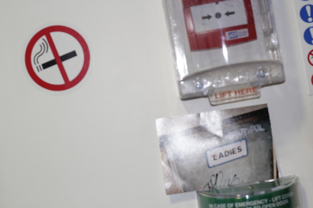
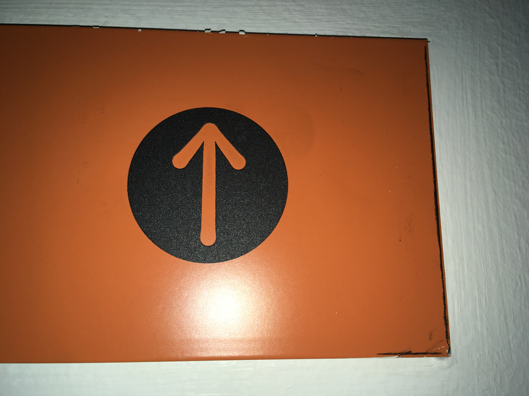
i was being imaginative because i took photos in unusual places.
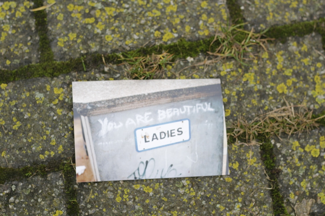
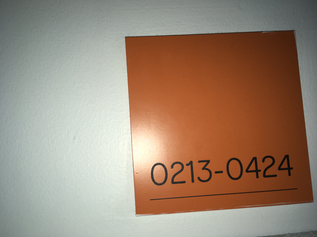
this is the best image because i like the way the flash reflects of the sign .
edges exabition
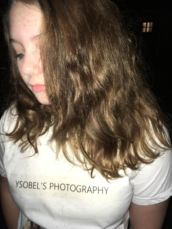
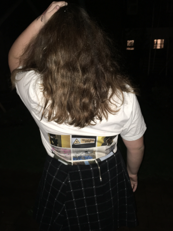
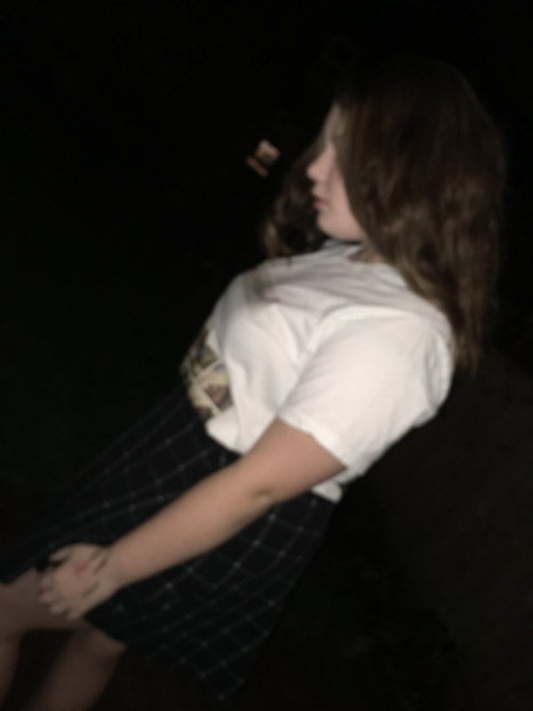
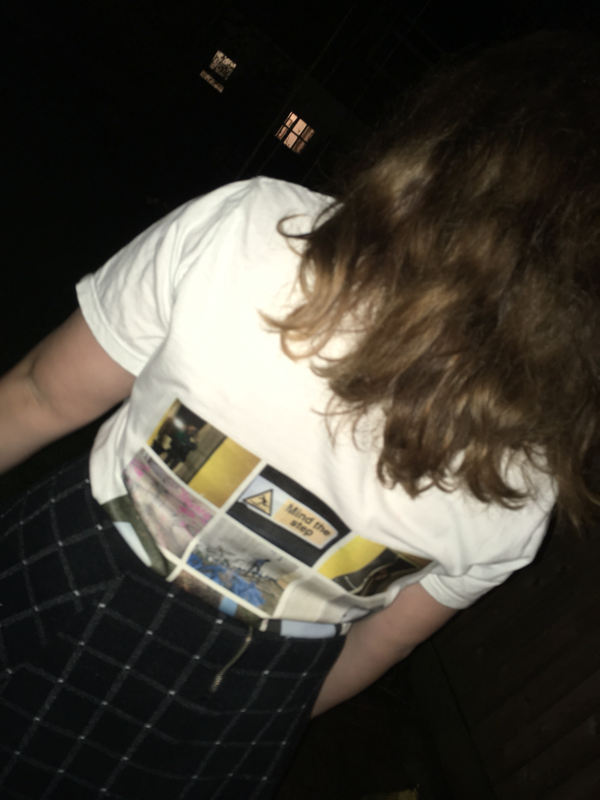
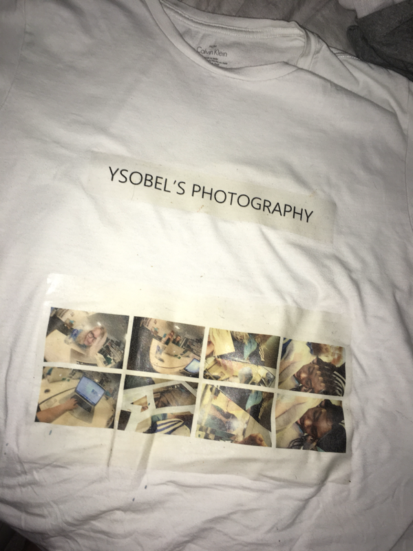
sir told us to choose a selective group of photos and display them in an interesting way I choose printing my pictures on to fabric and doing a photo shoot.
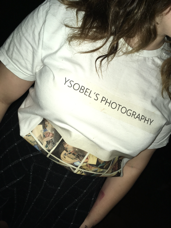
this is my flyer .
here is the tops font and back .
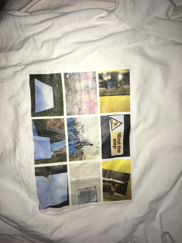
i choose specific photos that complemented each other and had similar Color schemes .
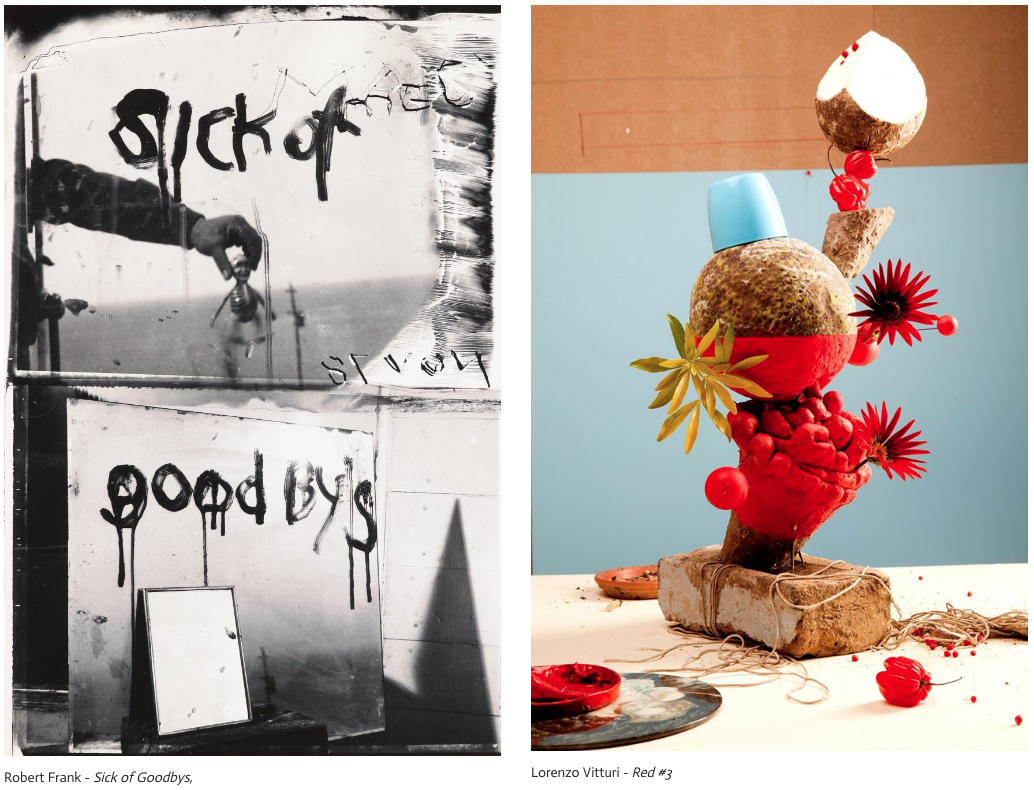
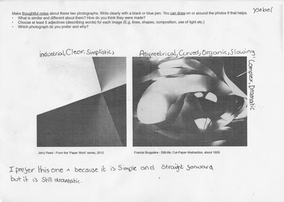
Both of these artists produced interesting photography. artist one used your metric shapes produced by mirrors and a different range of angles . of the first image it is also monochrome and gives out a surrealist vibe this draws you to it .on the top half of the image you can clearly see that on the right it is smudged this makes the top image look manipulated and have more imperfections .as you can see on the bottom right (top section )there is unclear letters or numbersmaking us question what it says above this you can clearly see that it spells Mel this looks similar to the writing below he might try to connect the two .on the bottom half of the image I can see multiple mirrors which creates do you metric shadows the bottom half picture is taken at a slight angle mean that you can see the image of the road this adds more depth and creates an illusion .there is also and effective colour contrast which makes the mirror stand out in the second image .the artists use bold colours and makes the image look like it's in sections even though it's just an allusion made by the different colours .the composition is quite messy and abstract in the white section it doesn't look effective but in the blue and orange section the colours work together and it looks more effective .the things that I recognise in the first image is the mirrors because we use them in class and they create affective edges but the thing that seemed new to me is the way that they have put their hand into the picture in the top because in pictures are usually try to avoid putting my hand in because it would make it look more real but he makes it look affective . has also misspelt goodbyes this makes you wonder why he did that and makes you confused .on the second image the image of the things that seem normal and the colours because I use quite bright colours in photos but the thing that seems new is the way that he has made it into the sculpture .the main similarity in these pictures are that they are both abstract piece of art another similarity is that they both have bricks in the Image .the main differences are that one is portraying an message in writing and the other is portraying a message in objects
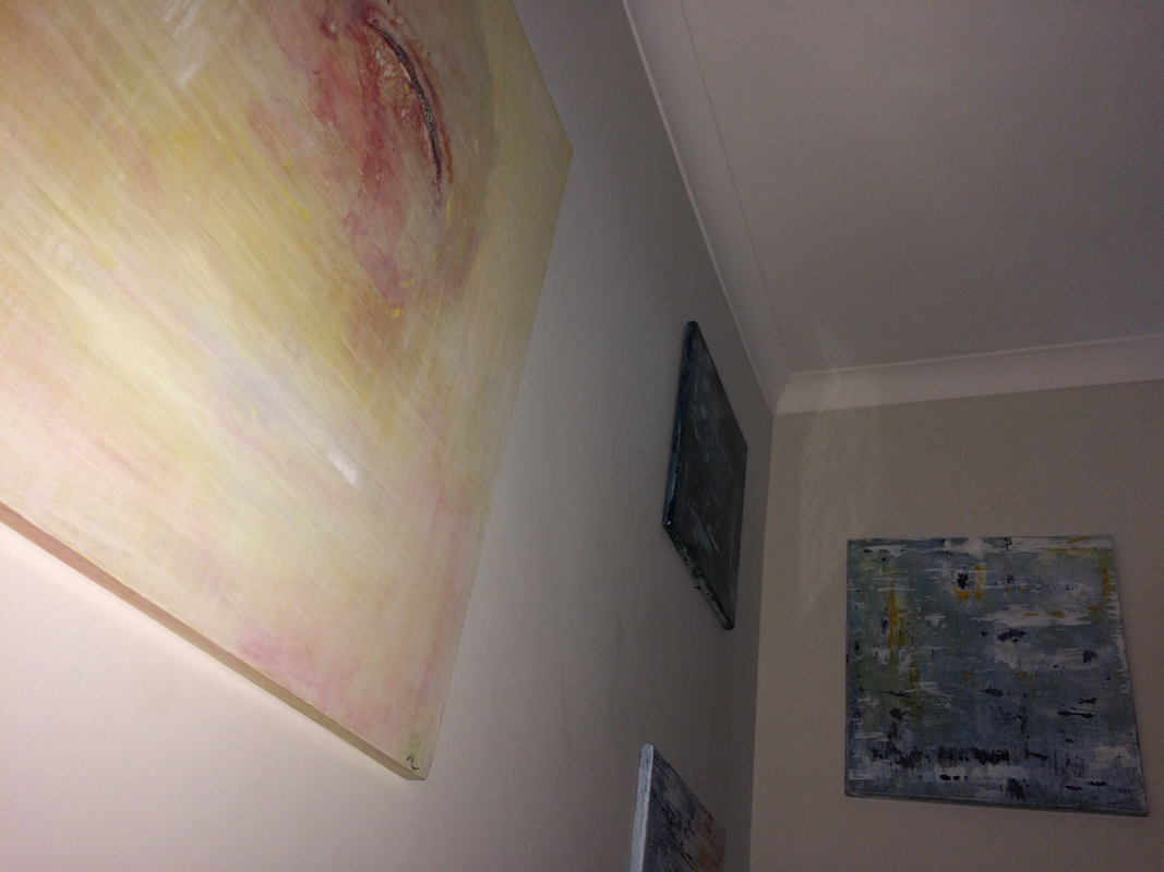
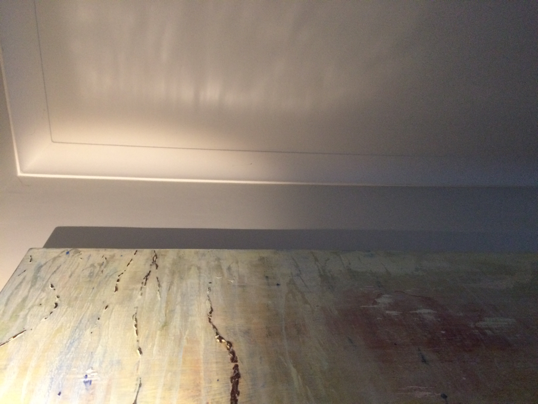
my final peace

i choose to mount my pictures on black card because it made the colours pop . Since there is some black in some of the images it gives a good effect .
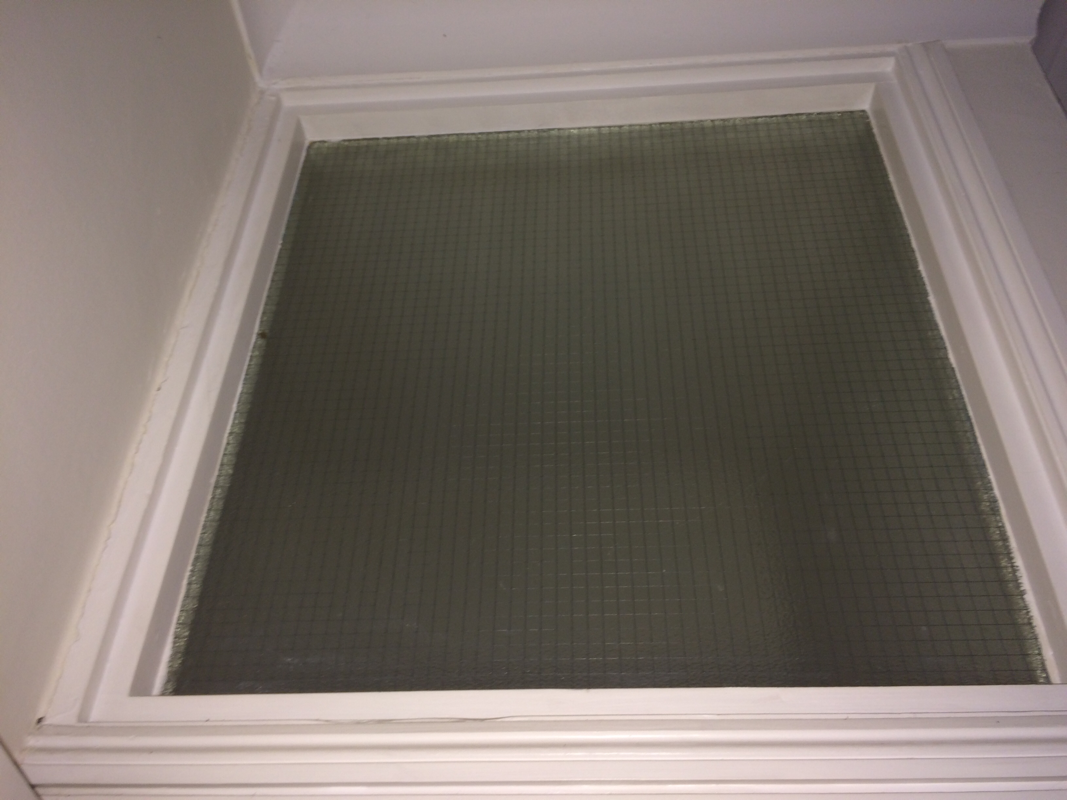
I choose to experiment with gridded paper and over laying the photos it looked quite effective and I am pleased .
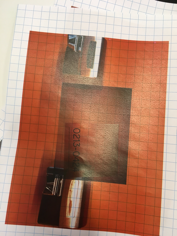
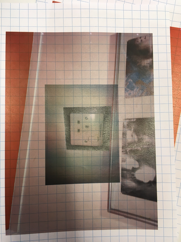
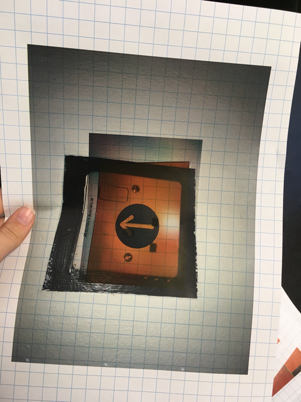
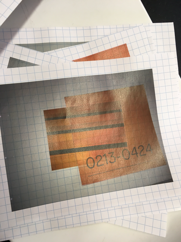
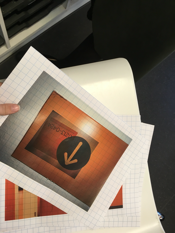
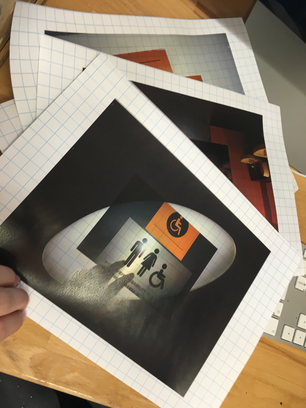
www:the colour contrast looks good and it looks effective
EBI: the images are not the same size and the cutting wasn't good .
EBI: the images are not the same size and the cutting wasn't good .
